Update (07/01/2021) – EB
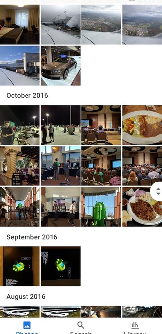
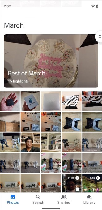
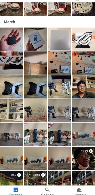
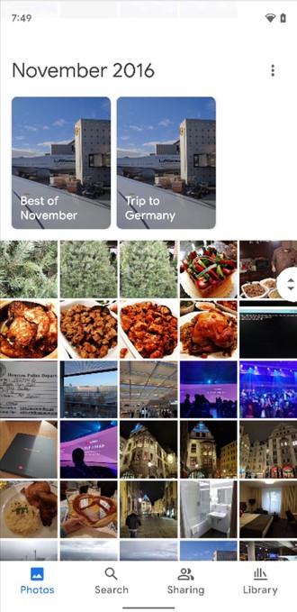
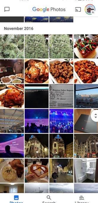
In early June, we already showed the new Google Photos interface based on Android 12 Material it might look like and today it will finally reach more users, at least according to our testing on our Android 11 device, which already features the new design like you can see below:
As you can see, the font with the names of the months is now larger, which gives more importance to this type of grouping in Fotos. The Search tab has also received some improvements, showing recently visited places and frequent topics in photographs.
Another new feature is the Memories tool, which is also coming to the app. With it, you can see the memories created by Google Photos on your Android home screen. See how it turned out:
The new version of Fotos is being released to users today in conjunction with an update distributed on Google Play with version 5.49.0.381968315. In our tests, the new interface is already available for some Android 11 devices and is no longer limited to Pixel line devices.
However, the new interface may also be linked to a change in Google’s servers, so if it’s not yet available to you, just wait because it will arrive in the next few days.
What do you think of the new look in Fotos? Tell us in the comments!
Original Article (02/06/2021)
Android 12: Google Photos to get a new look with Material You coming soon
Google Photos has become the most talked about topic among photographers and Android users in recent days with End of unlimited storage for free users. However, this shouldn’t be the only news of 2021 for the app, which should get a new look based on your Android 12 material soon.
Evidence of the change was found by user @damned_im, who came across the new design in Fotos 5.43. See a comparison between the new version and the current version.
As you can see, the new design will have larger fonts, making it easier to navigate between dates in the app.
It is worth noting that this new design is not enabled on the Android 12 phone, but on the first generation Google Pixel with Android 10, which is very curious, after all it does not use even the latest stable version of the Google system.
The screenshots you’re seeing were created by XDA Developers, who analyzed and modified the Google Images version 5.43 APK file code, enabling the new design.
Some of the changes are functional, like the history of the photos now remaining in the upper left corner even when you scroll to see more photos in the library.
Another interesting change is the easier visualization in the map mode. Now if a certain set of photos are taken in one place, the app will suggest switching to the map view to see more details and nearby locations.
Finally, it’s worth noting that Fotos isn’t the only Google app that gets minor UI tweaks. Chrome has already received some new details, too. e Google Feed has already gained the option to adapt the background colors used on mobile phones with Android 12 installed.
It is worth noting that the new look is not yet active for all users and Google has not yet commented on it, so this may be a gradual change in the company’s servers that are still testing the improvements reported today in Google Photos.
Google Photos صور
Developer: Google LLC
Free – Offers in-app purchases
Size: Varies by device
know more

“Web geek. Wannabe thinker. Reader. Freelance travel evangelist. Pop culture aficionado. Certified music scholar.”


